Every year we get a new crop of smartphones with bigger screens, faster processors, more storage and better cameras. While we'll see dozens of new devices with similar specs, they'll all be compared to the Samsung Galaxy S10+. That's not to say that this is the best smartphone we'll see in 2019, but it will set the tone for every other high-end device we'll see this year. The real question that we hope to answer is if the Samsung Galaxy S10+ is really worth its $1,000 price tag.
Hardware and design
The new Samsung Galaxy S10+ and its smaller siblings are pure Samsung. Samsung's been honing its design language for years and it's become impossible not to spot and identify a Samsung phone as soon as you see it. While this is great for brand recognition, it's a bit of a disappointment for anyone who was hoping for a new look. You get glass on the back again, a sleek metal frame along the edges and the usual mix of buttons on the sides with the charging port and speaker on the bottom.
The overall size of this phone is pretty small when you consider how big the display is, but Samsung managed to make it feel a bit bigger than it actually is with the placement of the power button. Unless you have massive hands, you'll have a hard time reaching the button with your thumb without readjusting your grip a bit.
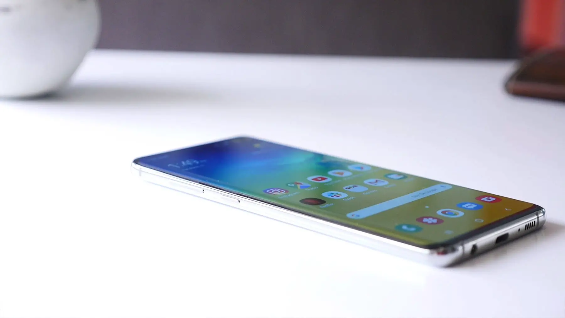
As for the overall feel, the Galaxy S10 Plus feels thinner than it is with the curved glass on the front and back and the thick metal frame sandwiched in the middle. It's not as sharp as last year's S9+, allowing the phone to nestle into your hand quite nicely. The minor design tweaks make the phone look and feel better than last year's model, but with so few changes since the S8, it does feel like Samsung is stuck in a rut, unsure of where to go next.
The unassuming design on the outside does a great job of masking the phone's immense power. On the inside, the Samsung Galaxy S10+ is equipped with the new Qualcomm Snapdragon 855 SoC and 8GB or 12GB of RAM with storage options ranging from 512GB to 1TB. While we have not tested the S10+ with 12GB of RAM, 8GB seems to be more than enough for heavy multi-taskers and mobile gamers. With the combination of the internal hardware and Samsung's new software, the user experience is superb. You can fly through menus, jump between apps and even pick up a game exactly where you left off after a call without noticing a skipped frame.
Display
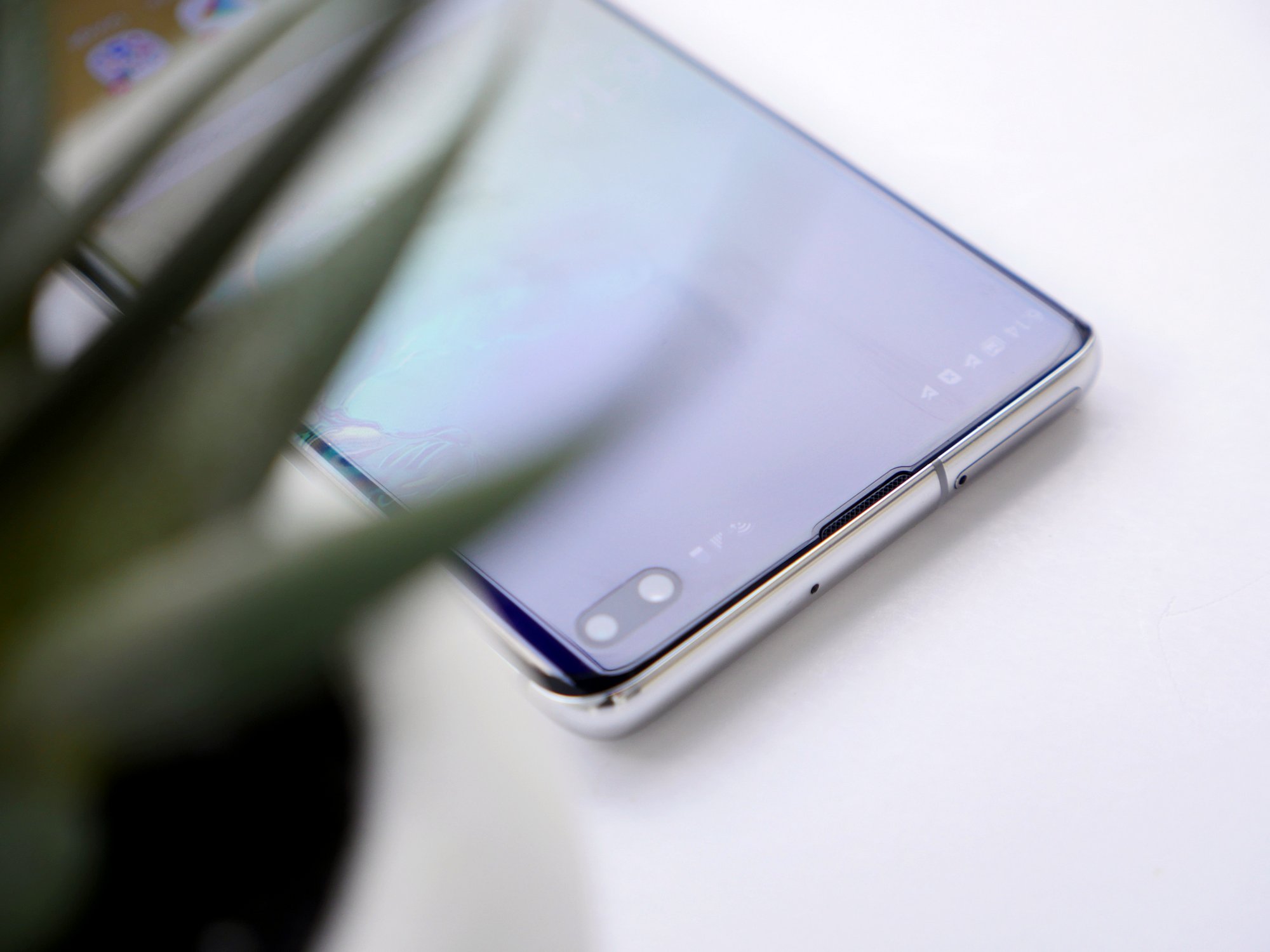
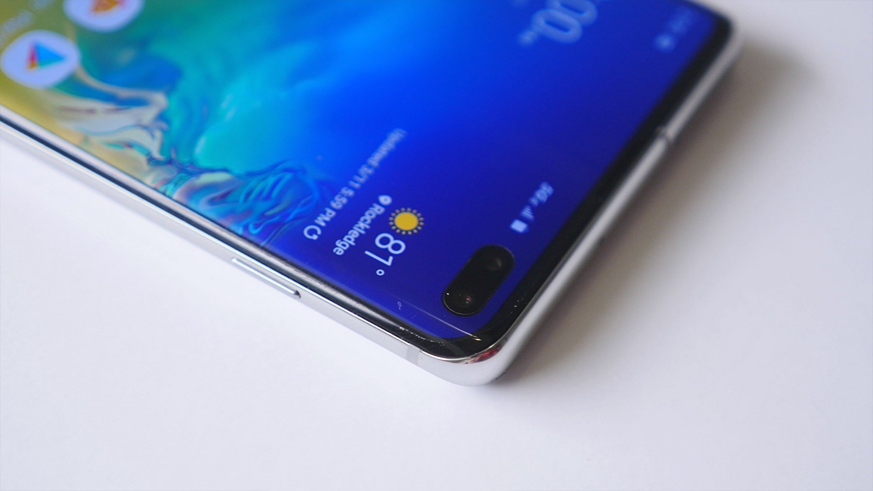
Naturally, the first real change that people will notice is the camera which protrudes through the AMOLED display. Samsung isn't the first to give us the hole punch cutout, but their implementation is pretty good, using the Pixels around the camera to highlight its position when you're taking a selfie. But, the placement in the top right corner means the time, battery indicator and other status icons all get shifted over. This makes it more noticeable than if it was on the other side. Samsung does give you the option to hide it by blacking out the top bar as you would on other devices with a notch, but that actually makes it look worse. To be honest, it's only a minor annoyance. If you're fine with the notch craze we were subjected to last year, you'll likely have no issues with the hole-punch.
As for the display itself, the AMOLED panel is absolutely gorgeous, stretching to the far edges of the phone with minimal bezels all around. The panel is one of the brightest we've ever seen, allowing you to use it outside without any issues. Unlike previous models, Samsung finally added HRD 10+ certification which brightens up the shadows in movies and shows to expose more detail. The new panel also reduces blue light emission by 42%. This isn't really noticeable until you use the phone at night or in the dark, but it's definitely a nice touch.
Out of the box, the screen resolution is set to FHD+ which saves on battery, but we recommend switching over to its full WQHD+ (3040 x 1440) resolution if you want to take full advantage of every Pixel that Samsung packed into this phone. The default screen mode is also set to "Natural," but if you want a bit more pop, the "Vivid" preset will do the trick.
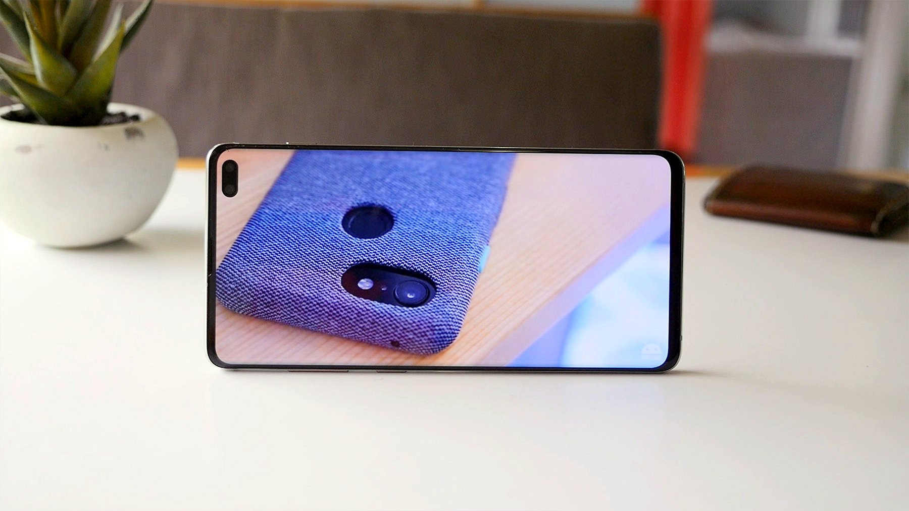
With all that being said, the curved edges of the display are still a bit of an annoyance. Don't get me wrong, the aesthetic appeal they offer is unquestionable, but there's no functional benefit to the curved display and glass. In fact, the added glare you get from the curved edges actually detracts from the practically perfect display panel and the sad thing is that it's most noticeable when you're setting back to enjoy a movie or show. In all honesty, the S10 and S10+ would be better phones if Samsung would have given them the same flat screen treatment as the S10e.
Ultrasonic Fingerprint sensor
One of the new features included in the S10 and S10+ is the in-display fingerprint sensor. While we've seen similar tech on devices like the OnePlus 6T already, the Samsung is the first to introduce the world to Qualcomm's ultrasonic fingerprint sensor which promises to be more accurate and secure than the basic optical sensors that others have used.
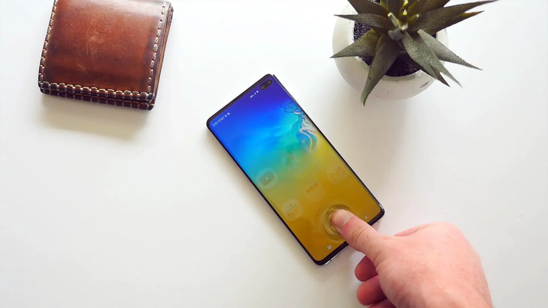
I have to admit that unlocking the phone by placing my thumb on the display feels like I've stepped into a futuristic sci-fi movie. It typically works quite well, but it does take some time to find just the right spot the place your thumb. The position of the sensor is a bit awkward as well since it's pretty close to the bottom of the display. It's not an issue when the phone's sitting on your desk, but it does require a bit of stretching to reach it if you just pulled the phone out of your pocket. Tapping the display when it's off will show you exactly where your thumb needs to go, but that also takes an extra second.
As far as speed and accuracy go, the ultrasonic sensor is faster than other in-display sensors I've tested and a lot more accurate. That being said, it's still slower and less reliable than the standard fingerprint sensors most of us have become accustomed to.
Battery and Charging
Over the past few years, Samsung's been playing it safe when it comes to battery capacity. We don't blame them, another round of exploding phones wouldn't exactly be good for business. Fortunately, the S10+ has a 4,100 mAh battery which delivers the best battery life we've seen from a Samsung phone in a very long time.
5 hours of screen-on time is the least you should expect out of this phone, but you can easily stretch that to 7 or 8 hours on a single charge if you stay away from games. I've managed to stretch things out to two days, but I wouldn't recommend it as you'll likely need to switch over to the phone's power savings mode which throttles the CPU, reduces screen resolution and limits notifications.
The phone does offer wired and wireless fast charging which can top the phone's battery off in about two hours, but Samsung has also thrown in reverse wireless charging which allows you to share your phone's power with other devices. This feature only delivers 4.5W which can add an extra 15-20% charge to your friend's phone over dinner but don't be surprised if that completely eats through your S10+'s battery. It's really intended to be used on small accessories like Samsung's new Galaxy Buds or a smartwatch, but it's a nice feature to have if your friends are desperate for some extra power at the end of a long day.
Cameras
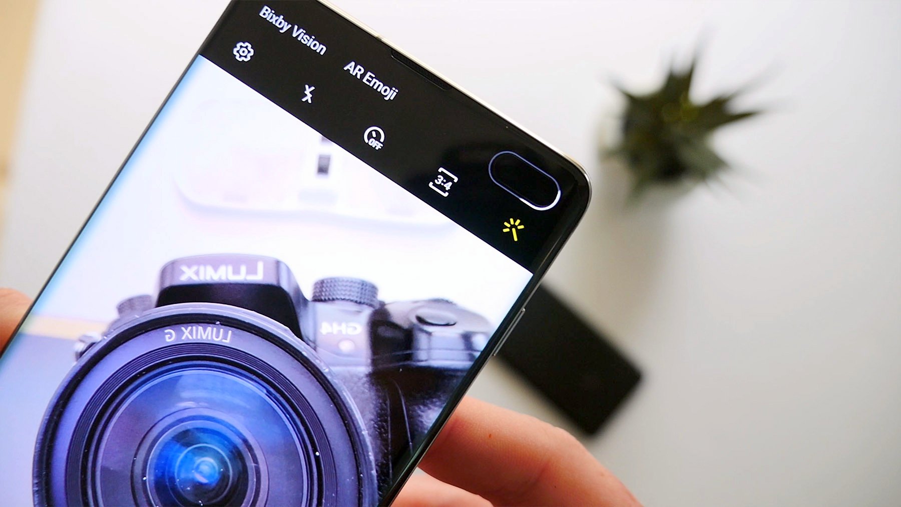
When choosing between the different Samsung Galaxy S10, 10+ and 10e, the number of cameras they each have comes into play. As you'd expect, the S10+ has the most with a total of five sensors, three on the back which are paired with standard, telephoto and ultra-wide lenses and two on the front which includes the usual front facing camera which is accompanied by a depth sensor.
Since those front-facing cameras are what you'll notice the most on this device since they're peeking through the phone's display, let's get them out of the way first. The main sensor captures 12MP images while the secondary 8MP sensor is only there to capture depth information. As we've seen on previous Galaxy devices, the main sensor is paired with an autofocus lens, which is still uncommon these days. It does a decent job or capturing selfies, even when the lighting isn't just right and the depth information from the second sensor delivers decent portrait-style shots with a blurred out background. I wouldn't say that this phone delivers the best selfies I've ever seen, but they're definitely better than most. One thing to note is that dynamic range is actually pretty good, so you'll be able to capture great images outside without completely blowing out the blues in the sky.
Honestly, Samsung should have used an ultra-wide angle lens with the second sensor and copied the Pixel 3's front-facing camera setup. I'm not exactly sure why the S10+ needs two sensors to deliver the blurred background is portrait shots since the S10 and S10e can deliver similar shots with their single front-facing cameras.
Color me disappointed.
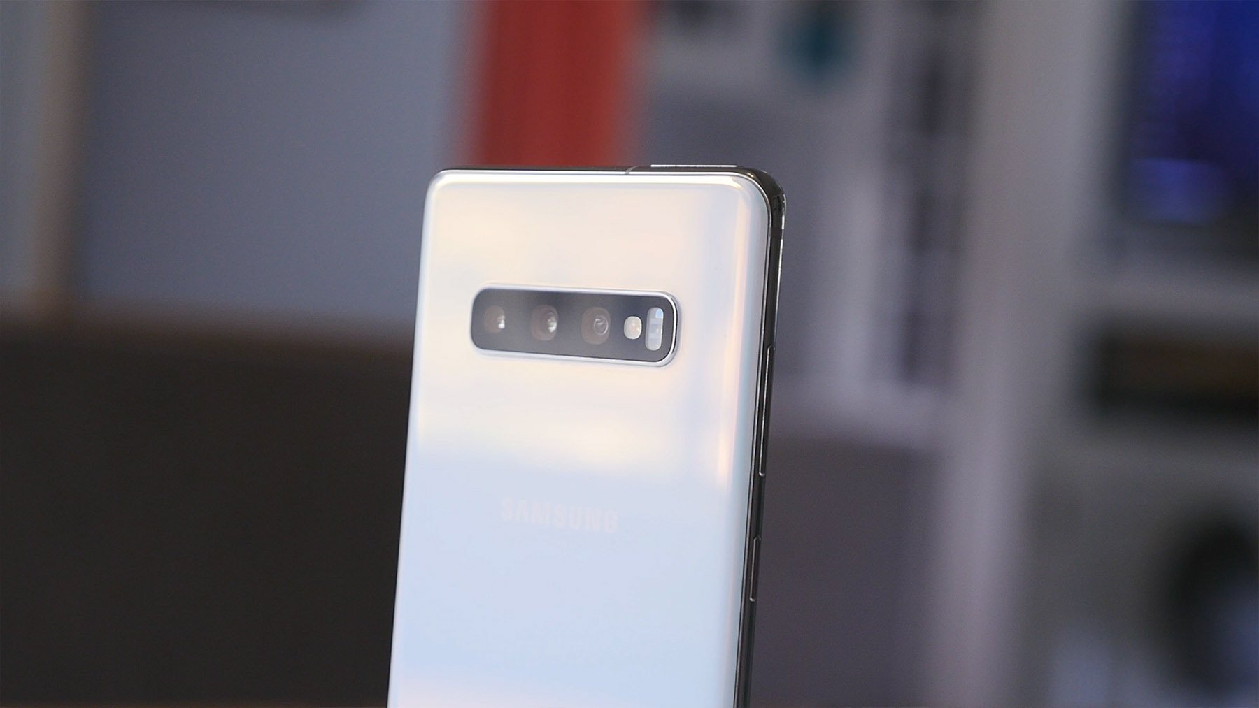
But the good news is that things get better with the triple camera on the back of the S10 and S10+. You get the same standard and 2x telephoto lens and 12MP camera setup as last years S9+, but this year Samsung has thrown in an additional 16MP sensor which is accompanied by an ultra-wide angle lens which offers up a 123-degree field of view. While this is a new feature on Samsung phones, LG has been using ultra-wide angle lenses on its flagship devices for a few years.
The benefit of the ultra-wide angle lens is far greater than the 2x telephoto lens, but it's nice to see that Samsung simply didn't swap one out for the other. Capturing images with the ultra wide sense gives allows you to get shots that you simply can't capture on most other devices. There is some barrel distortion to contend with when taking pictures inside or of a narrow street, but it's not really noticeable when you're taking landscape shots.


Switching between the three sensors and focal lengths is pretty easy with the three buttons which appear right next to the shutter button on the screen. But as per usual, Samsung's camera app can get pretty complicated with dozens of settings that most people won't ever change. The good news is that you really don't need to tweak anything right out of the box.
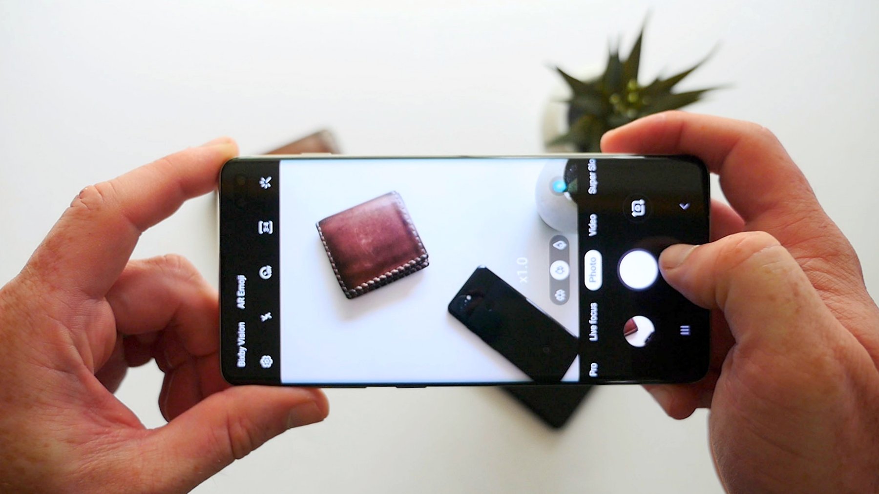
As for image quality, it's hard to say if Samsung has stepped things up over the past year. We've done a few side-by-side comparisons between the S9+ and the S10+ and the results are really close. It looks like the sensor's sensitivity to light has increased resulting in a slight improvement to dynamic range, but the default settings on the camera deliver images which are slightly warmer than what we'd expect. Samsung has also kept the same exposure settings as it did with last year's phone, producing images are brighter than what you'd get on more other smartphones. While this looks good when zoomed out, you'll easily be able to spot graininess as soon as you zoom in.
The second 12MP sensor and telephoto lens do come in handy from time to time when you want to zoom in to capture the details of something that's quite a ways off, but Samsung isn't using it anymore as the main sensor for taking portrait style shots. The sensor is being used to capture depth information, but the actual shot is now being captured with the main sensor. This actually gives you a little more wiggle room to fix in a second or third person in the picture without needing to take 4-5 steps back. I always thought it was a bit odd that Samsung and other manufacturers copied the iPhone's approach when Apple introduced its dual-camera setup.


Samsung's phones do have a new software feature called Shot Suggestion which uses AI to recommend different ways to frame your shot. It uses a horizontal line on the screen to ensure that your holding the camera straight, but it'll also pop up a little dot on a person for you to match up to ensure that they're perfectly centered. These suggestions can come in handy if you're not an experienced photographer, but they don't leave a lot of room for artistic expression. After testing it out for a day or so, I simply turned the feature off and never looked back.
Like the Pixel 3, the S10 phones also come with a dedicated shooting mode for low light situations called bright Night. When enabled, Bright Night will capture multiple images of a scene and then stitch them together to pull in as much light as possible. The results are spectacular when you compare them to the standard camera mode, but there's still a big gap if you're matching things up with the Pixel 3.
Software
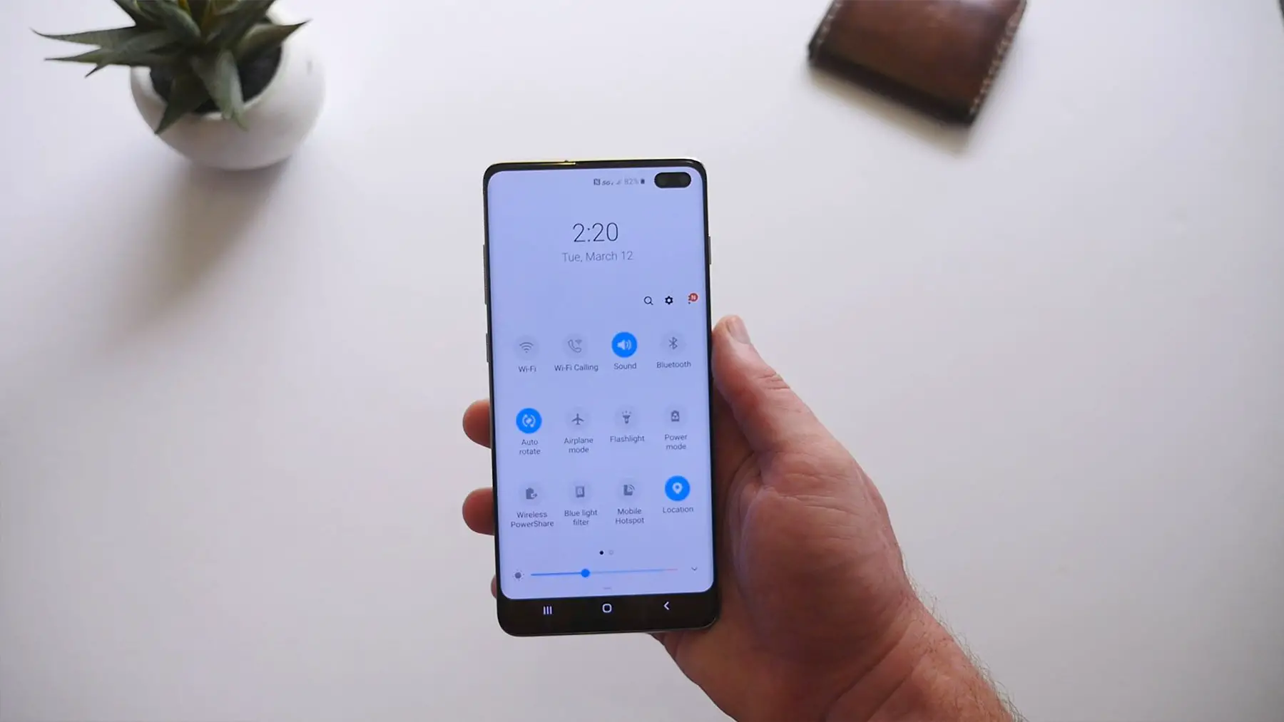
The software on Samsung's phones has always been a point of contention. Samsung has always tried to pack in as many features as it possibly can into its builds of Android, but that's often left us with an experience that's less than optimal. >
Thanks to Samsung's new One UI design language, things are looking a bit different this time around. This is easily the best software we have ever seen on a Samsung smartphone. They've cleaned up all the design inconsistencies that have muddled things up in the past and have actually gone out of the way to make the software easier to use by making sure that UI elements can be reached without having to readjust your grip of the phone. This means that everything has been shifted down to the middle of the screen when you jump into any of Samsung's apps or dig into the settings. It does feel a bit odd at first, but you quickly come to appreciate the change once you realize that you're not adjusting the grip every few seconds to tap the top item on a list.
A personal gripe I have with the design of One UI is the rounded corners that are applied pretty much everywhere. The radius matches the rounded edges of the display, but to me, it feels extremely out of place.
As you'd expect, Bixby is still alive with new features which Samsung claims will make your life easier. We'll do you a favor by only highlighting one. The Bixby button on the site of the phone can officially be remapped. That's right, you're now able to jump into settings and choose to map a single or double tap to launch another application you have installed on the phone. Unfortunately, Bixby will still remain mapped to one of the two button press options and Samsung has decided that Google Assistant doesn't qualify as a remapping option.
I also wanted to mention that while the phone is running Android 9 with the February security patch, Samsung hasn't been doing a great job recently of keeping its phones up to date. Most of its flagship devices typically only get security patches every 3-4 months and last year's S9 received its Android 9 update about 5 months after Google officially made it available. I can't say that the S10+ will suffer the same fate, but it's definitely something to consider
Conclusion
It goes without saying that the Samsung Galaxy S10+ is the best Galaxy S yet. Samsung's been refining the design and features for a decade and it seems like this year, they've managed to give us a device that has a lot more positives than negatives. The S10+ has great cameras, good software, battery life that's better than most and cool new tech like the ultrasonic fingerprint sensor and reverse wireless charging. And I think I forgot to mention that the 3.5mm headphone jack is still included.
The question is: should you really pay $1,000 for the Samsung Galaxy S10+? Most definitely!
Yes, there are plenty of other phones out there that give you similar features for less money, but Samsung's new flagship smartphones are still a step or two ahead of the competition and for that, you should expect to pay a bit of a premium.
Samsung Galaxy S10+ Rating: star_fullstar_fullstar_fullstar_fullstar_50 (4.5 / 5)
The Good
- AMOLED display
- Battery life
- Build quality
- Rear cameras
- Software
The Bad
- Front-facing cameras
- Edge display
- Price
The Bottom Line
Samsung has delivered an incredible smartphone with the Galaxy S10+. It sports new tech features without giving up on the old ones like the 3.5mm headphone jack. At $1,000, it's not exactly cheap, but if you have the money to spend, it's definitely well worth the price tag.
from Phandroid https://ift.tt/2JceqwU
via IFTTT
No comments:
Post a Comment