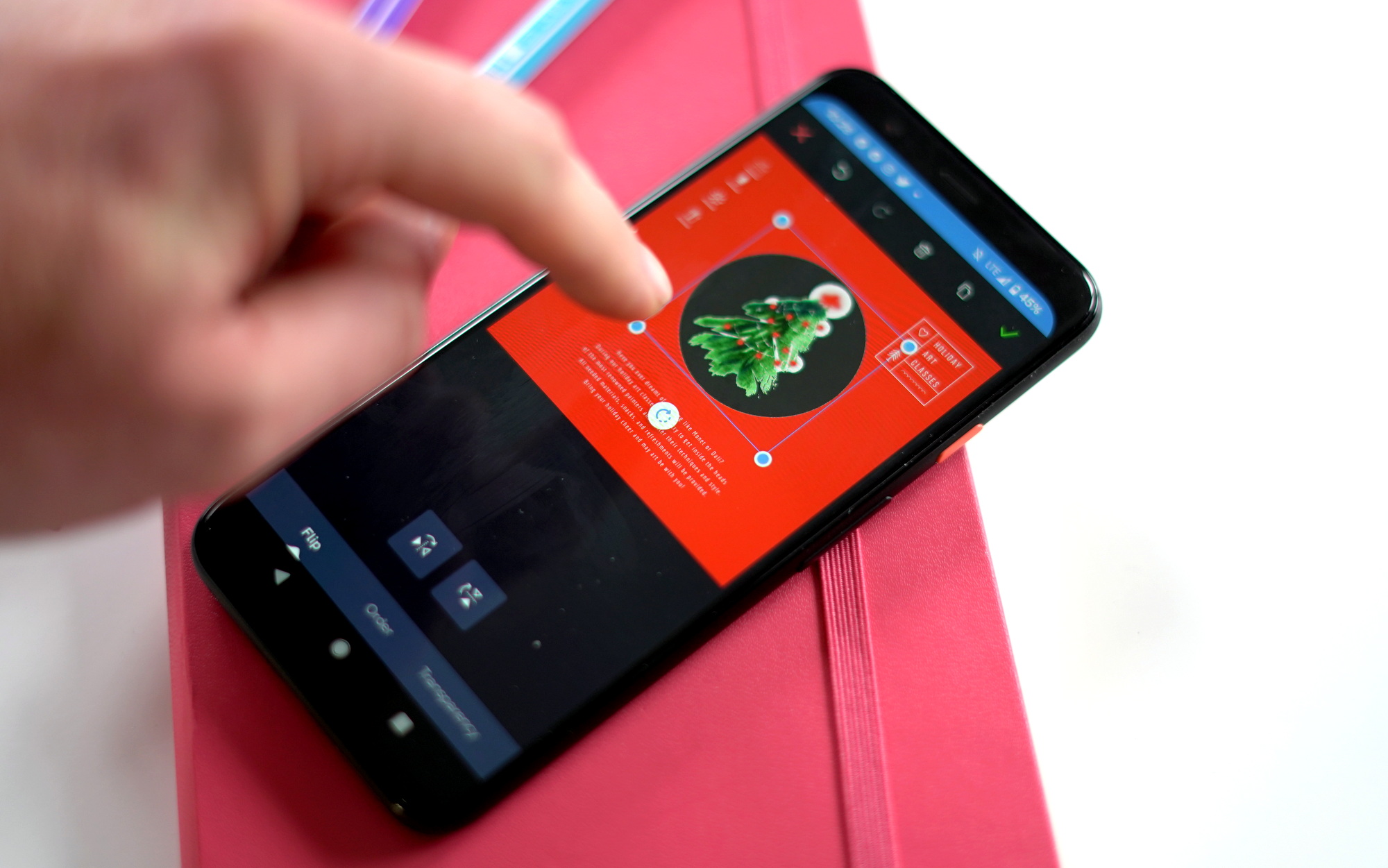
If you have spent any time putting together visual content for social media, a website, or an email newsletter you know that this can be both a frustrating and time-consuming process. These are the problems that Crello looks to solve for you, Crello is a free design tool that offers thousands of templates, photos, and formats to help you quickly and easily craft visual content. While Crello also offers a robust web-based design tool, today we are just looking at the Crello Mobile app.
We're going to walk you through the major features of the app and then I'll take you step-by-step through creating a quick banner for this very article so you can see the tools in action near the end of the review.
Inspiration
After creating your account the first thing that you are greeted with when booting up Crello Mobile is the Inspiration section. This offers you literally thousands (20,000+) of completed templates to choose from across 22 categories including Beauty, Food & Drinks, Pets, Technology, Travels & Vacations, and more.
You can either filter by these larger categories or if you have something really specific in mind you can do a keyword search. Given the immense collection of templates available it would be nice to be able to use both the category and keyword search simultaneously to really narrow down your options, but regardless it never took me too long to find a template I was happy to start with.
Formats
Now if you are literally just looking for inspiration then the above is the way to go, but if you need something for a specific task, like you want to create a YouTube thumbnail or a Twitter header image then you'll want to tap the rectangular button at the bottom center of the home screen.
This is the Formats selection screen and in the mobile app there are four categories to choose from; Animated designs, Social media posts, Covers & Headers, and Blogging. Within each of these are further options that will dictate the size and shape of the template like Instagram Story or Facebook Event Cover, there are a total of 22 distinct formats.
From here this looks exactly like the Inspiration search screen, but it will now be limited to the format that you are looking to create. And to be clear if you won't want to use a template at all you can simply tap the action button in the lower-right corner and start from a blank canvas.
Design Tools
Once you have your template selected you are into the design screen. You have a pretty full suite of options available to you here so we'll cover them individually.
Text
You can edit any existing text from the template or create your own text boxes. You have full control over the text with hundreds of font options, text size, color, orientation, alignment, and spacing.
Layers
You can create layers and move objects between layers. This includes full-color layers with transparency controls to create a tint over your design.
Arrange
You can move, flip, crop, rotate, and change the transparency on any objects or layers that you create.
Objects
You can add or remove objects and photos in the app, this includes the over 500,000 premium stock images in the app and over 100 million stock images in total and a library of shapes, icons, illustrations, frames, and lines. You can also upload your own photos to the app if you prefer.
Sharing
Once you have completed your design you tap the icon in the upper-right corner and the app finalizes your design, this process takes 1-3 minutes. Then you are presented with the option to either share your design, this just pulls up the standard share sheet menu so you can share it anywhere, or you have the option to download it to your device.
Pro plan
The free Crello account gives you all of the same features as the Pro account, but you have a Crello watermark on your designs. The Pro account is either $9.99 a month or $7.99 a month if you pay for a full year in advance. Users of the mobile app have two months of free access to everything available from Crello. This feels a bit pricey for personal use, but if you are using this as a business tool, which is the real intention for the app it's a solid value.
Using the app
I decided my test case for the app would be creating a header to use for this article, so I'll walk you through the process as I wanted to see how quickly I could get on board and get something ready to share using the app.
Installation was quick and account creation just requires an email address and a password. Now there isn't a tutorial or anything as you start the app up for the first time, but as I'm sure you might have noticed from my descriptions above the interface for the app is straightforward and easy to use.
I selected the format that I wanted, in this case a blog header. I didn't really have a theme in mind for the header so I just scrolled through what was available until I found something that I liked, an Academy Award styled header.
Select an object is as simple as just tapping on it and then you are given the contextual options for that object at the bottom of the screen. Double tapping on the text allowed me to edit it and then I dragged and resized it to fit in the laurel wreath images. I would note that for me it was easier to add my own text than edit what was already there, you can make all of your font and style selections in advance that way.
Then I deleted the existing background image and searched for a smartphone image. I found one that I liked and then resized it to fit the header. It would be nice to be able to just type in the size that I want for the image given that I know the dimensions, but dragging and dropping was quick enough.
Once the image was in place I decided I wanted a bit of a filtered look to the whole thing so I added a new layer and used the color palette to create an overlay.
That was it, from start to finish it took me approximately 5 minutes to put this together. Now if you are putting out an important piece of marketing material I'm going to say you should spend a little more time getting everything perfect, but I was curious to see how fast I could do something that at least I thought looked good enough to share on social media.

Final Word
I came away quite impressed after spending a couple of days with Crello. I do a fair amount of work in Photoshop and Illustrator and while I'm not suggesting this is standing in for a substantial portion of what you can do with those apps, as a mobile design tool for creating content to share online it performs admirably.
The tools are intuitive without being overly simplistic and given the wealth of stock content and of course the ability to upload your own photos the creative options are pretty limitless here. The fact that you get access to the full functionality and stock library in the mobile app for two months is fantastic and gives you plenty of time to experiment with the app and decide if upgrading to Pro to get rid of the watermarks permanently is right for you.
from Phandroid https://ift.tt/2LrrBbT
via IFTTT

No comments:
Post a Comment