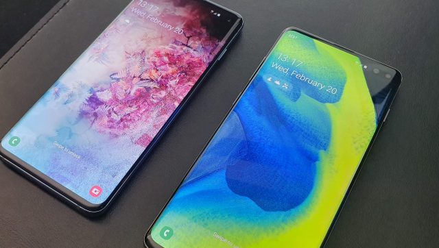
With new hardware comes new software, and even though One UI has been on the Galaxy S9 and Note 9 for around a month, Samsung has introduced some new features with the launch of the Galaxy S10, S10+, and S10e. The new devices come with Android Pie as standard running Samsung's new One UI software, and here are some of our favorite new features.
Bixby button remapping
This is absolutely the top of our list. Ever since the Galaxy S8, Samsung has insisted on putting a button on the side of its devices dedicated to only launching Bixby, its virtual assistant to rival Google Assistant. Since then, an ongoing game of cat and mouse has ensued between Samsung and developers to patch loopholes exploited by third-party apps to remap the button.
As of the Galaxy S10, Samsung finally lets you decide what the button is used for, natively allowing it to be remapped. There are two actions available – single press, or double press – and whichever one you don't remap will default to launch Bixby.
Camera Ring
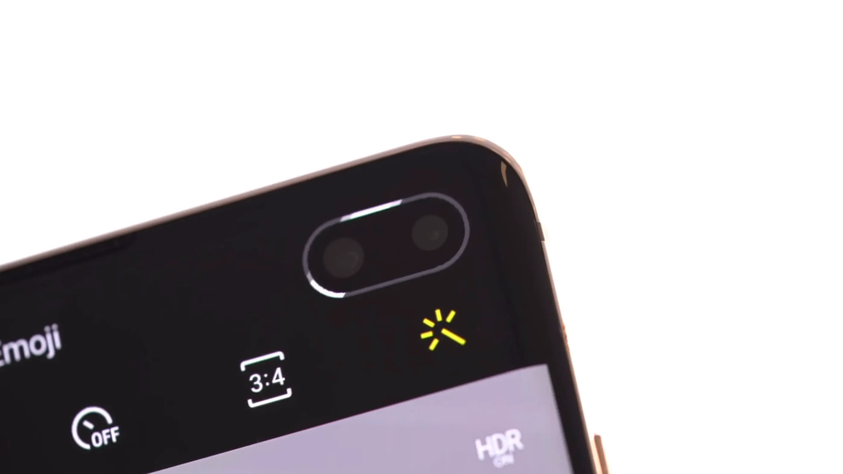
The Galaxy S10 series introduced a new hole-punch design for its Infinity-O screen to house the front-facing camera. We saw it in the renders as Samsung's answer to the notch, so knew what to expect. What we didn't see coming was the eye-pleasing ring that surrounds the hole-punch, which also doubles as a notification light. The ring of light will pulsate around the hole-punch and differs in color depending on the notification.
Digital Wellbeing
Google's focus on health became clear with the release of the Digital Wellbeing app as part of Android Pie. However, the app was exclusive to Pixel devices but has since made its way to Android One devices. The Galaxy S10 series is the first device that runs a non-stock Android experience to get Google's Digital Wellbeing, and that's pretty cool as it was completely unexpected. The app helps track your screen time within different apps to provide an idea of how you use your device, so it is great to see the app make its way to the Galaxy S10.
New icons

Installing a third-party launcher is the first thing I do on any Samsung device. I wasn't a fan of the icons that came as part of the Samsung Experience UI, but the new icons in One UI look a lot better. There's a lot of rounded corners, which match the UI throughout, and while the icons still look a little cartoony, they are a significant improvement.
Dark Mode
One UI has delivered one of the most asked for features on Android – dark mode. The new style is implemented at a system level, which means all native apps support it. It makes perfect sense to have a dark mode since it's not only easier on the eyes but also helps hide that hole-punch. Joking aside, the OLED panel and your eyes will thank you for the dark mode.
Open camera API

Samsung invited Instagram to stage to demo a new feature that allows social media companies to natively edit pictures utilizing third-party tools directly in the camera app. Samsung has followed Google in making its camera SDK open source, which allows the likes of Snapchat and Instagram to hook into the native camera app. This new open SDK allows brand new functionality on the S10 where the camera app has a special Instagram mode, which allows you to take a picture and send it directly to your Instagram story. It reduces the number of clicks to share images to and is great news for heavy Instagram users to now be able to push their favorite images in a single click directly from within the camera app.
Wrapup
While we've seen some of features debut on earlier Galaxy devices, Samsung launching the Galaxy S10 running Android Pie with One UI offers some extra added touches that show Samsung's intention with One UI, and it's now front and center of the Samsung Android experience.
from Phandroid https://ift.tt/2IwbdIl
via IFTTT

No comments:
Post a Comment